Context
Workboard is a strategy execution platform. Teams use it to run OKRs, KRs, KPIs, and leadership meetings in one place. In 2024 the company added Workboard AI Agents, a conversational layer where anyone in an organization can ask a question in plain language and get an answer pulled from the company's goals, results, and meeting data.
I led design on Agents, reporting to the VP of Product and Design. There was nothing to extend. I built the design system, the design language, and the interface architecture from scratch, then maintained them and ran the handoff to engineering.
Problem
The whole point of Agents was speed of understanding. A VP or CEO should be able to learn the state of the organization in a sentence or two, without digging through dashboards. For that to work, parts of Workboard's existing functionality - KRs, KPIs, meeting summaries - had to become Artifacts: self-contained objects an agent could pull in as context or generate on its own.
There was a bigger ambition behind it. Leadership wanted PMs and executives to spin up screens, iterate, and build investor-ready prototypes with AI, without a designer in the loop for every request. That only holds if the system underneath is coherent and constrained enough that non-designers can't easily break it.
None of it existed yet. No visual language for the agents, no components that suited a chat surface, and no way to show Workboard's data-heavy screens as something clean enough to sit inside a conversation.
Constraints
Three things shaped most of the decisions.
Six months, roughly, to go from nothing to a live product that fit the business. That alone ruled out the slow, do-it-properly ways of building a system.
The legacy stack. The existing product ran on PHP with no modern front-end framework. It was slow, and the screens looked their age. Anything I designed to appear inside the agents had to render from that system without inheriting its visual debt.
And I owned the coordination, not just the pixels. I worked with front-end and back-end engineers and PMs almost constantly - agreeing tokens, working through trade-offs, keeping scope and delivery in sync. I reported to the VP of Product and Design, but on the product itself the design calls and the daily engineering relationship were mine.
Process and key decisions
Two systems on purpose, instead of one clean rebuild
I was given the old design system and a fairly open brief. What was expected, unspoken, was a better system that didn't break the product that already existed.
The obvious routes didn't hold up. Forking the legacy system would be fast, but it splits the product into two visual worlds that drift apart. A theme layer on top is cheap, but it keeps all of the old structure's limits and fixes none of them. A full migration is the right answer in a vacuum and impossible in six months without breaking live screens.
So I built a second system for Agents and linked it to the original, then went back into the original and upgraded it in place - adding design tokens, agreed with the front-end team, and unifying the styles. I only changed what was worth changing; screens that worked I left alone, so nothing broke. The result was one token foundation feeding two systems: a modern one for the new product, and a quietly improved legacy one that stopped fighting it. On a six-month timeline, that is what let me move fast without leaving a mess behind.
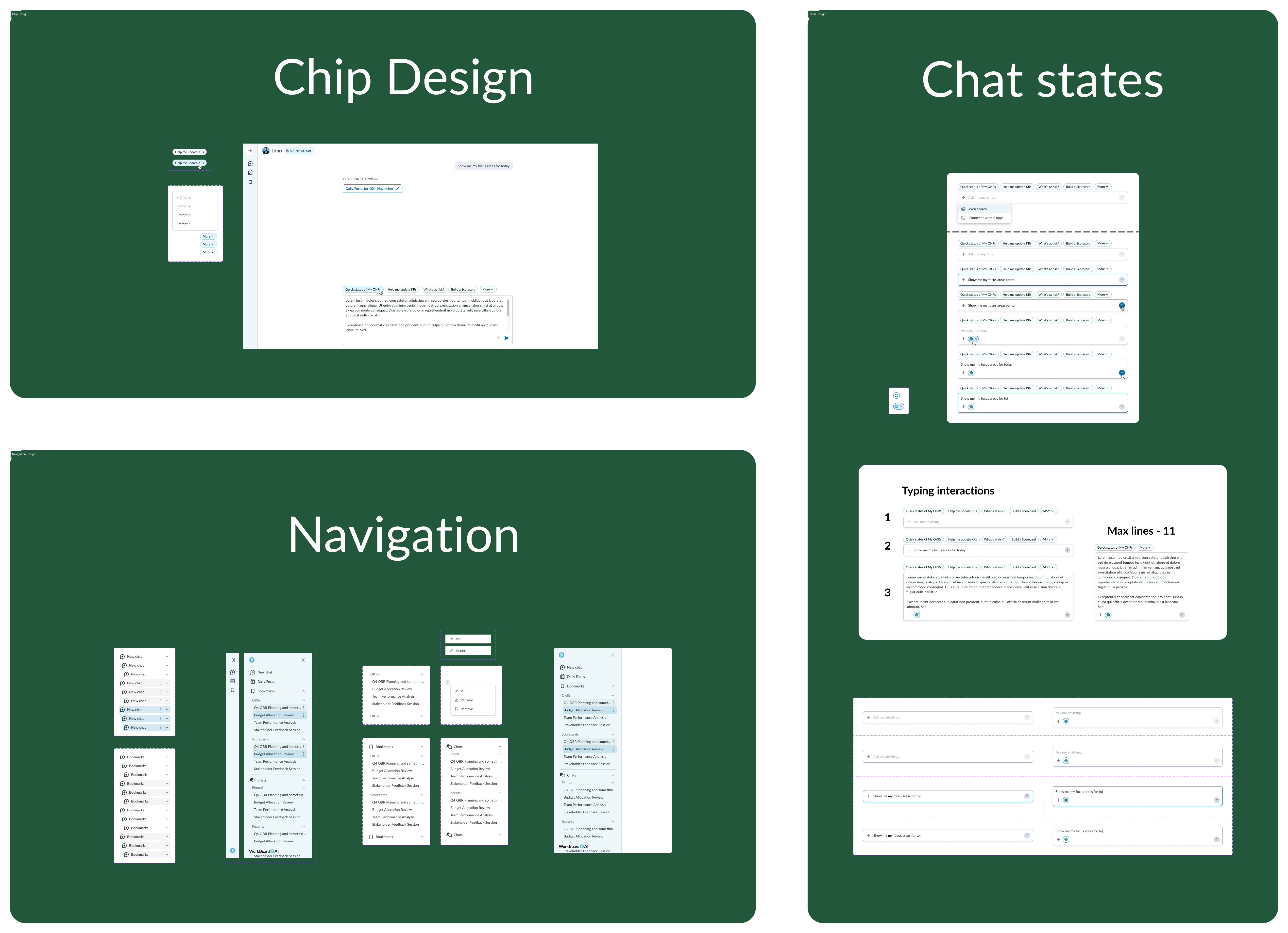
Making heavy legacy data feel at home in a conversation
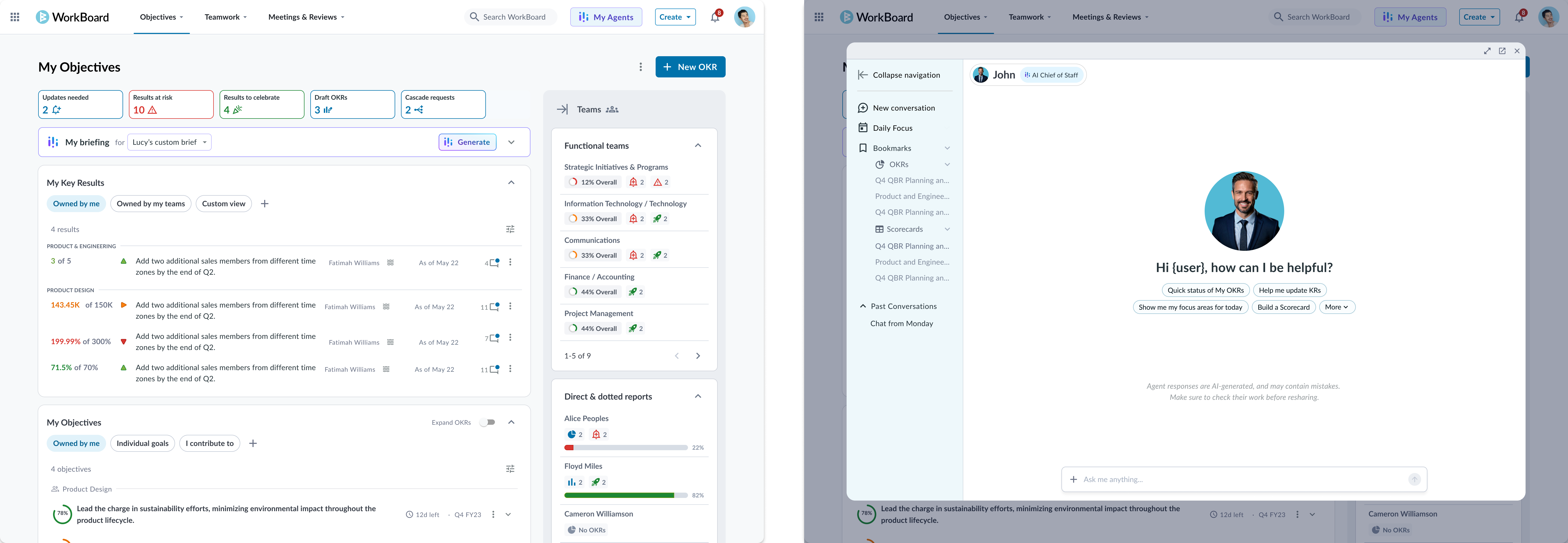
The trickiest part was turning Workboard's own content - KRs, KPIs, meeting data - into artifacts that belonged inside a chat client, when the data came from a slow PHP system full of dense, dated screens.
The easy version is to drop the existing screen straight into the chat. It doesn't work: the density and hierarchy are built for an admin view, not for someone scanning an answer. So I rebuilt these as artifacts made for the chat column, lighter and reorganized around what the reader needs in that moment. When an agent answers "how is this KR doing," the artifact shows the state of the KR, not every field behind it.
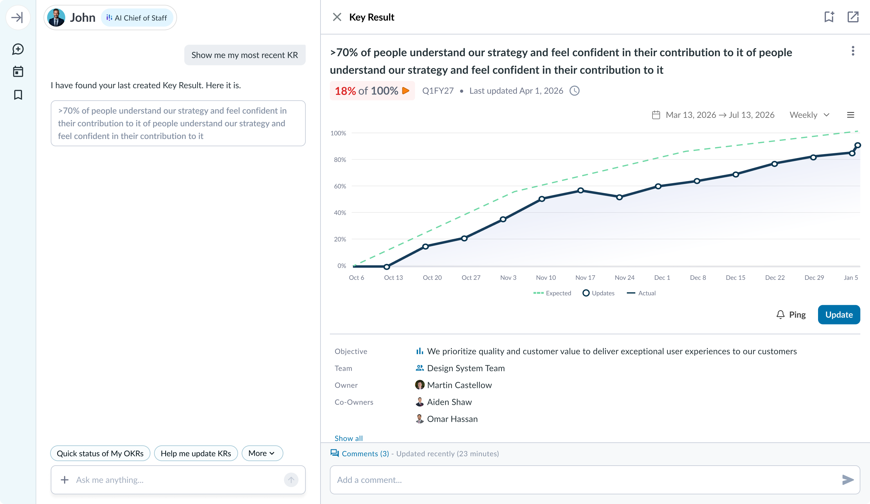
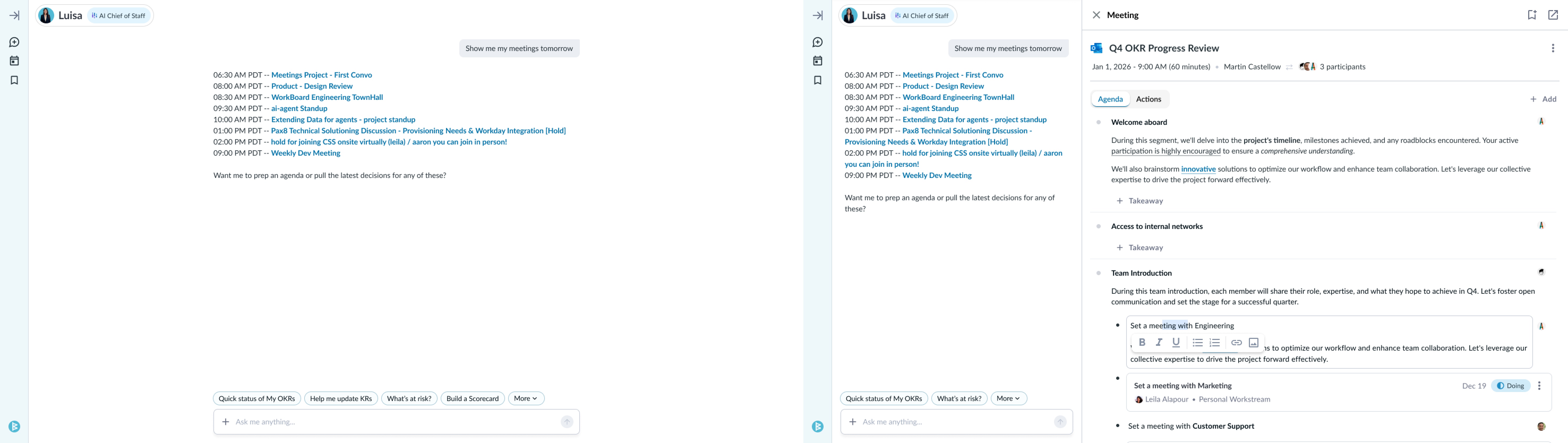
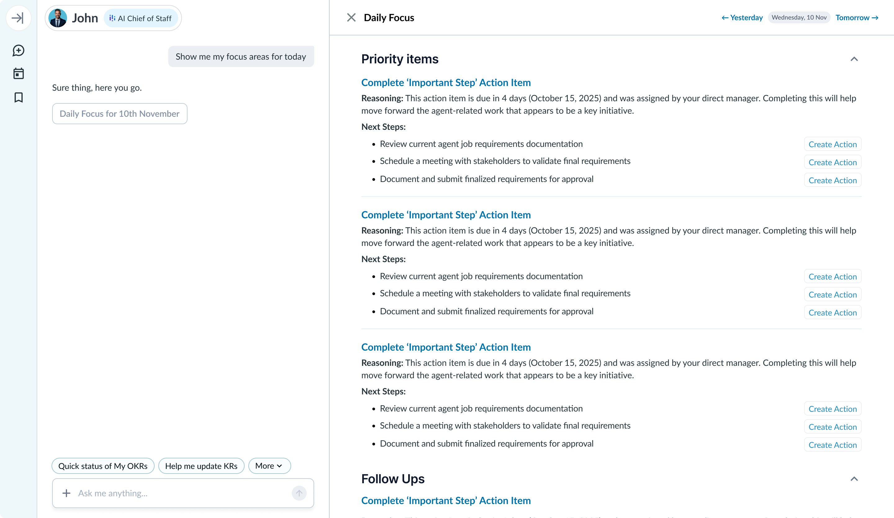
One system, every surface and state
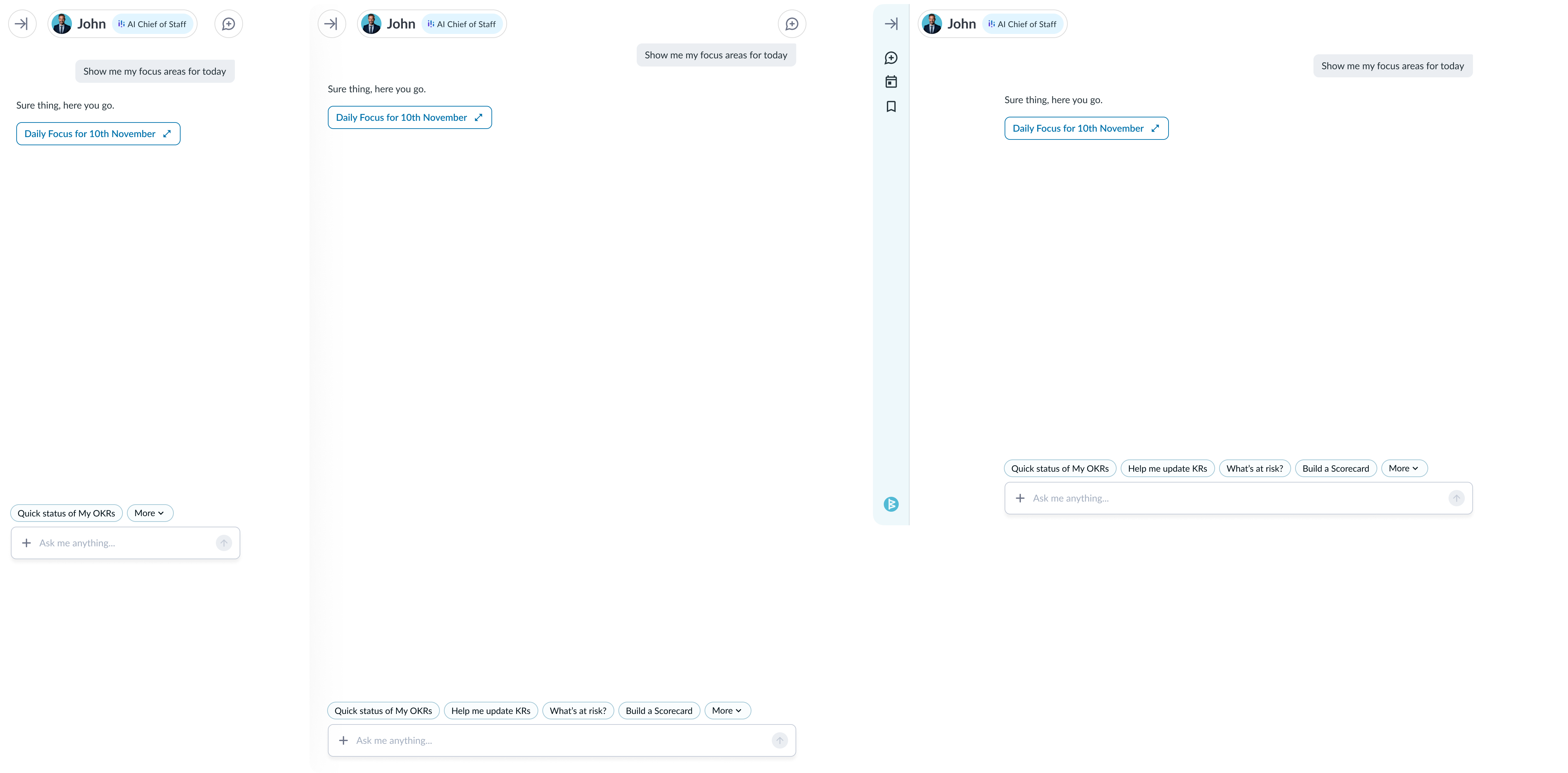
The system had to hold wherever the product showed up, so I designed it responsively - mobile, tablet portrait, tablet landscape, desktop - from one component language rather than separate per-device screens. I also designed the states a B2B product actually spends its life in: no access, no daily focus, opening in a new tab, follow-ups, the hiring flow. A dedicated illustration set kept the empty and edge states feeling deliberate rather than unfinished.
Outcome
The product shipped and people moved onto it quickly.
- Usage of the agents, and the number of questions asked, went up a lot after launch.
- Token consumption hit several million in the first month, a decent sign of real, ongoing use rather than a launch spike.
- Marketing campaigns built around the new agents were credited internally with a meaningful lift in new customers.
- Feedback from users was positive.
A note on the numbers: these came up in internal reviews and meetings rather than being formally measured and attributed to me, so treat them as directional. The new-customer lift in particular is campaign and product together, not design on its own. What I can say flatly is that the design language and system I built were the surface all of it ran on.
Reflection
I spent too long perfecting the chat component. Looking back, that time belonged in integration - wiring more of the existing and new features into the artifact model, which is where the real leverage was. A set of follow-up-question designs I liked never shipped, most likely down to engineering capacity rather than design. If I did it again, I would protect the high-leverage integrations earlier and let the polish be the thing that gets cut.
The honest takeaway: with six months and effectively one designer holding the system, the scarce resource wasn't design quality. It was choosing which surfaces earned the depth.