Introduction
This case study explores how redesigning a single visualization feature evolved into a reusable, scalable data visualization system - transforming both the product and the design process.
About the company
Arkieva is a supply-chain company with a range of products designed to help businesses plan and optimize their operations. One of its main focuses in recent years has been developing a modern SaaS platform that brings its proven supply-chain expertise to the cloud.
About the task
The task was to redesign the chart/graph that is displayed in the Planning Worksheet page under the S&OP category.
S&OP (Sales and Operations Planning)
Sales and Operations Planning is an integrated management process that balances a company's supply and demand. It aligns various departments like sales, marketing, and manufacturing to create a single, cohesive plan that optimizes resources, meets financial goals, and improves overall supply chain efficiency. This helps a company avoid issues like overproduction or stock-outs, leading to higher profitability and customer satisfaction.
Because of the complexity of the table below the graph - the current chart does not convey all of the needed information properly and could be improved.
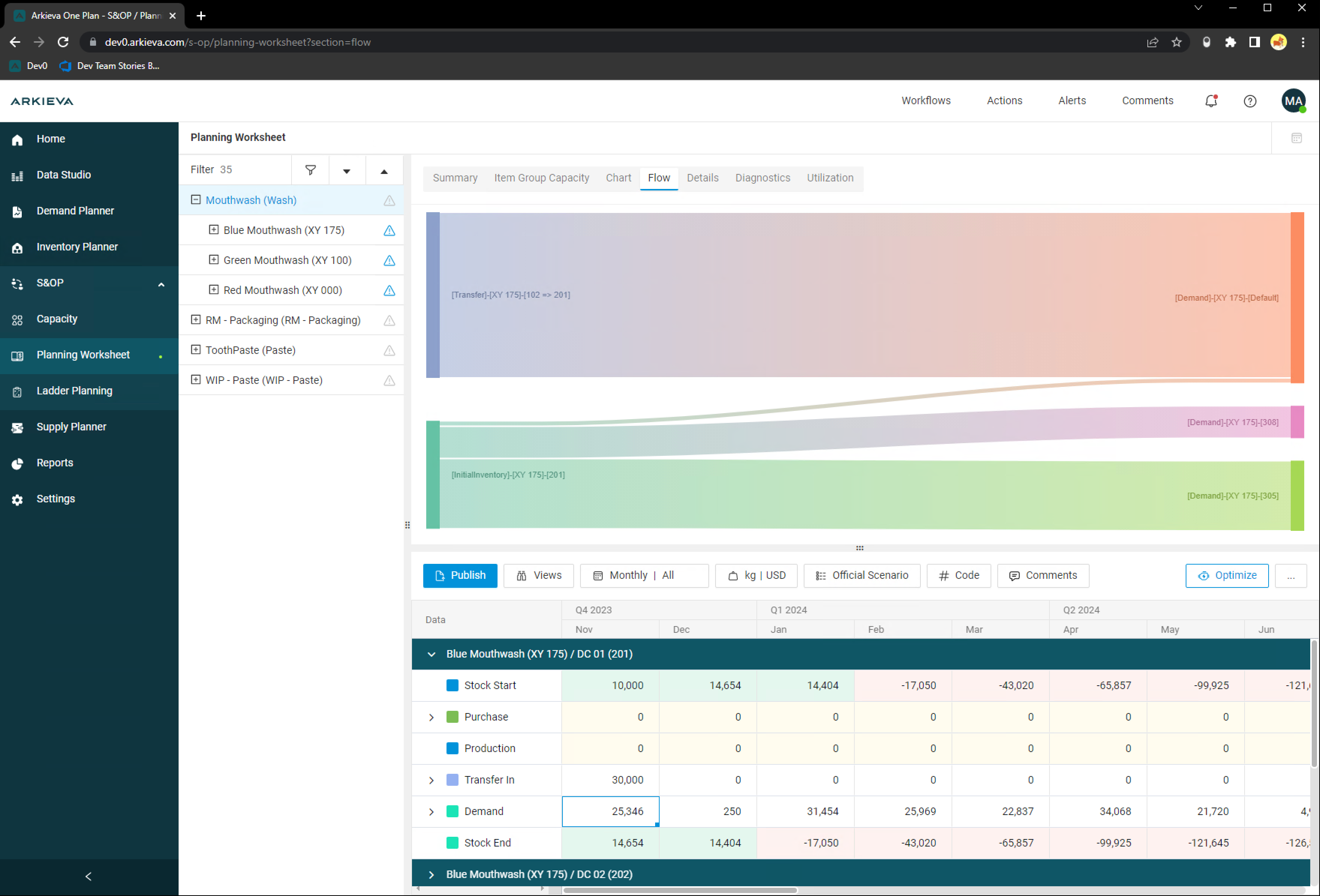
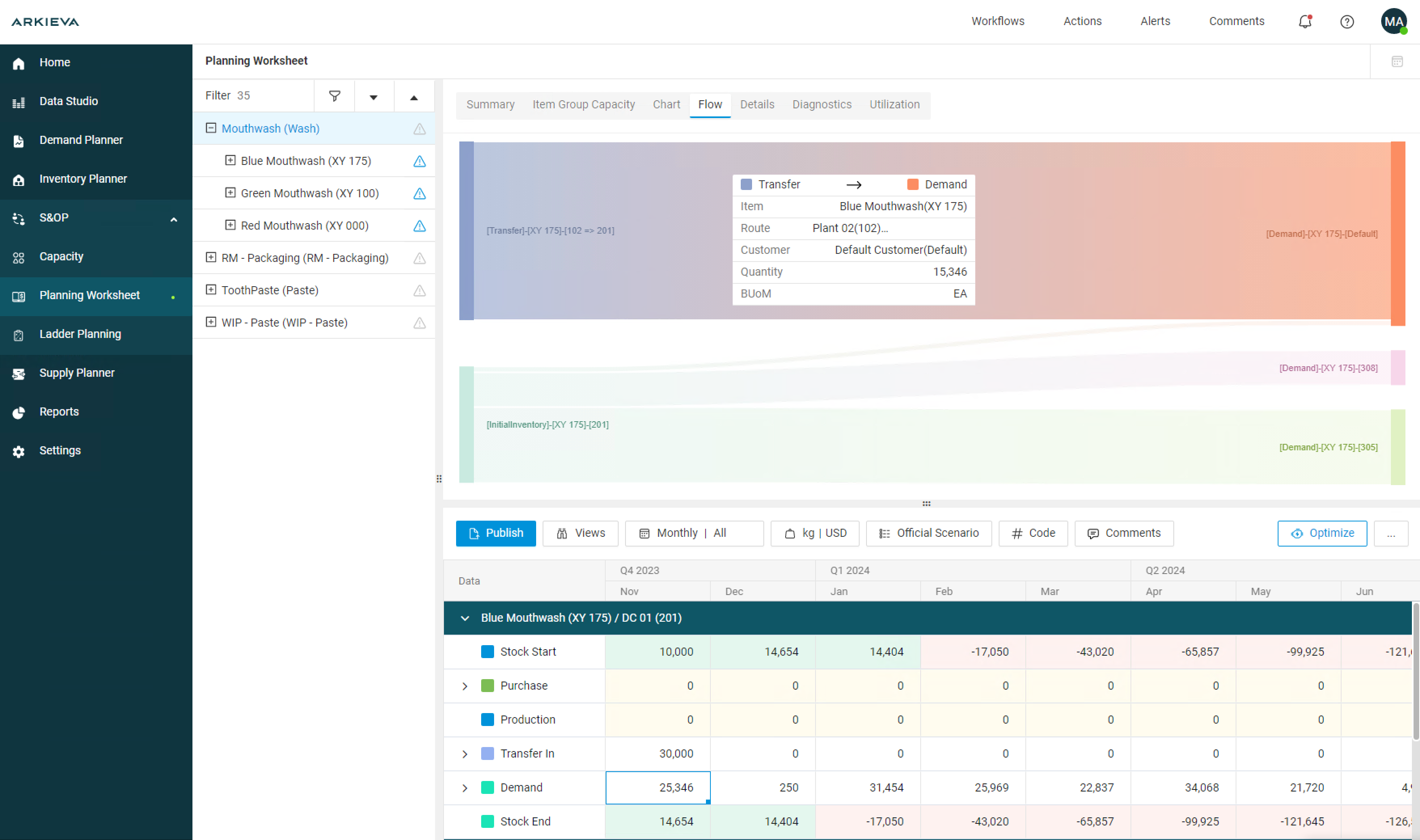
The Planning Worksheet was displaying a flow diagram (Sankey) that visualized the quantities of a given product or category and how they were distributed. The key feature back then was the width of the arrows or bands to be proportional to the flow rate, meaning a thicker arrow represents a larger quantity going somewhere.
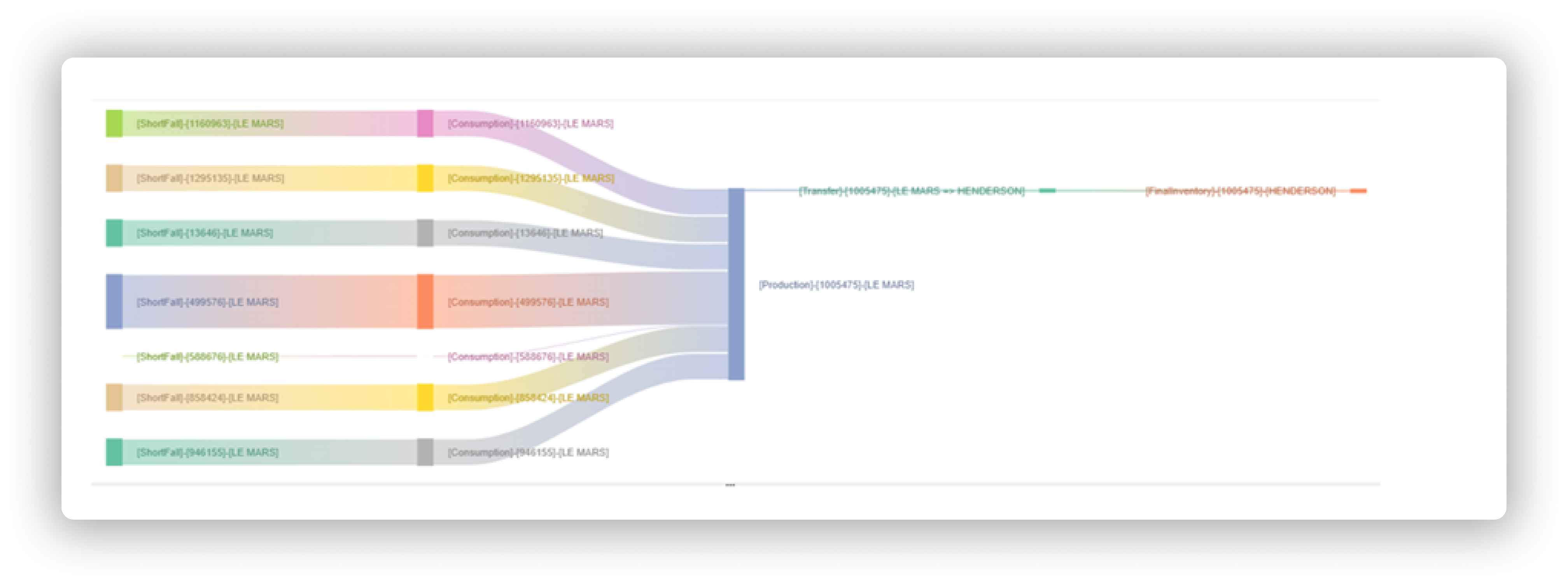
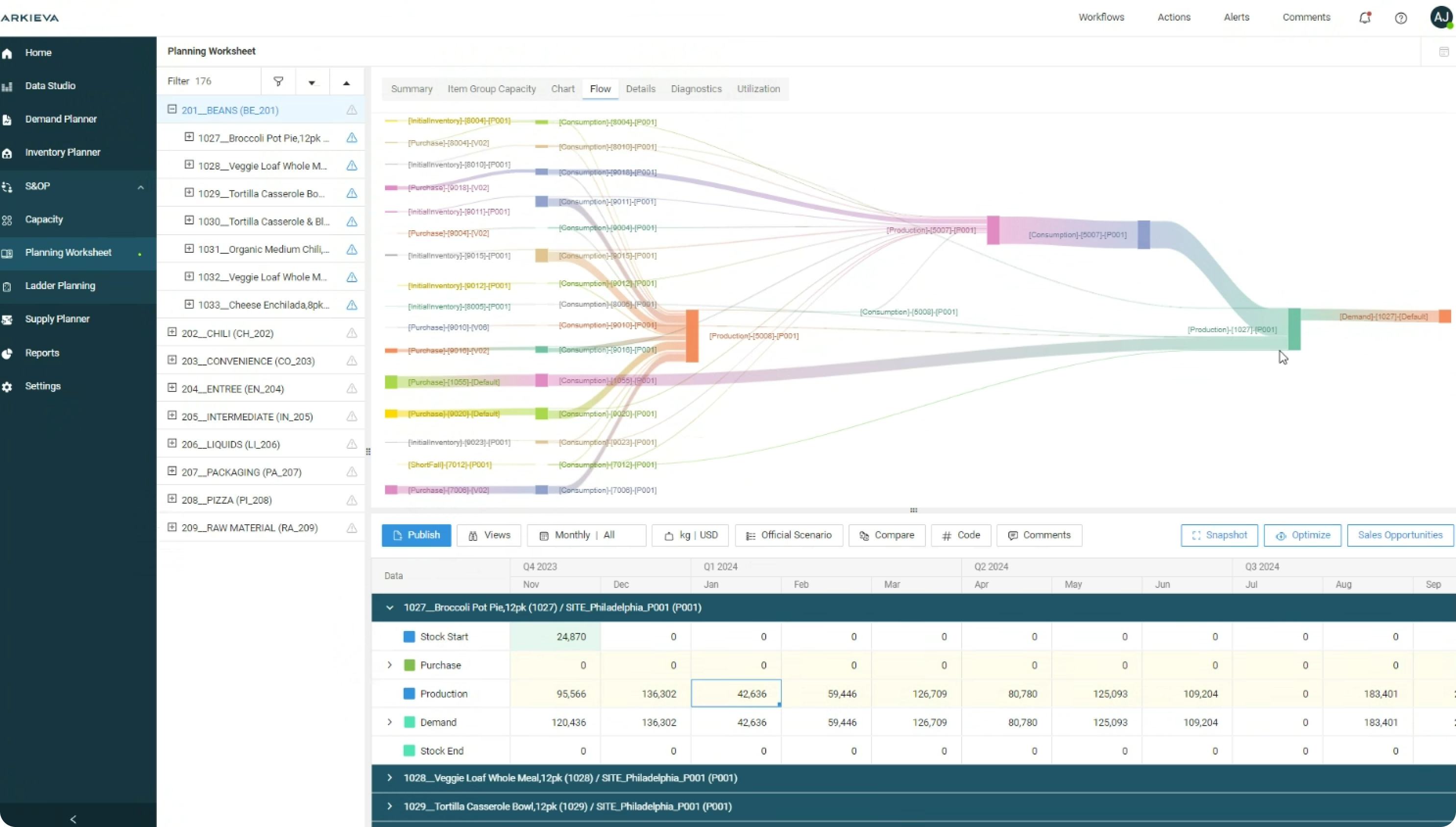
This got quickly out of hand for some products and the result was a mess of strings or bands that you can barely make out, plus it wasn't giving enough information on how things were moving and if there were any problems.
Things that were not clear:
- Direct flow
- Location
- Timing
- Integration points
The business wanted something that did a better job at displaying the currently available information and maybe something more if I can figure out what.
Research
Given the information that needs to be displayed and our current infrastructure - the choice for a chart/graph to replace our current solution was hard. The business wanted some sort of node-based preview which was hard to find since the data is very specific. After some online research, I was inspired by Supabase’s Schema Visualizer, which handles complex data and entities elegantly.
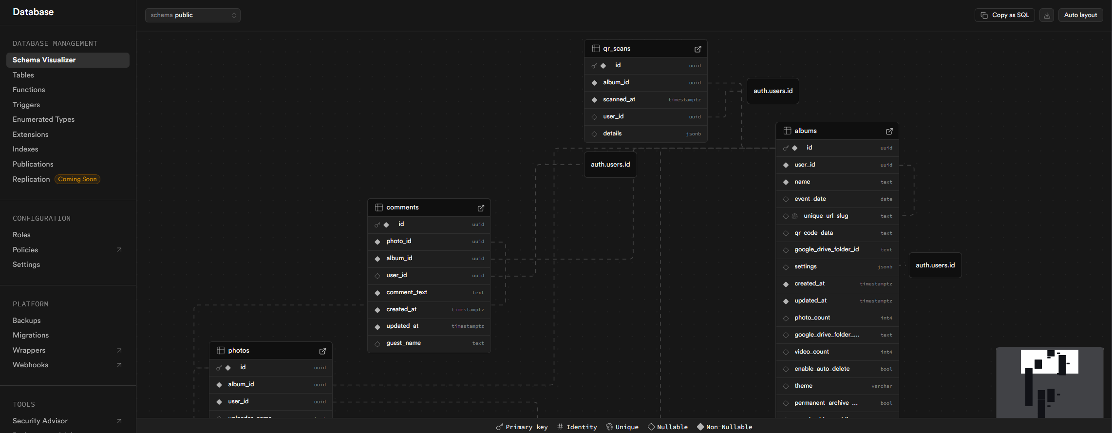
and wanted to know if the library is custom or is it something that we can use too. That's when I came across React Flow and suggested (and based my whole design on it) it to the development team.
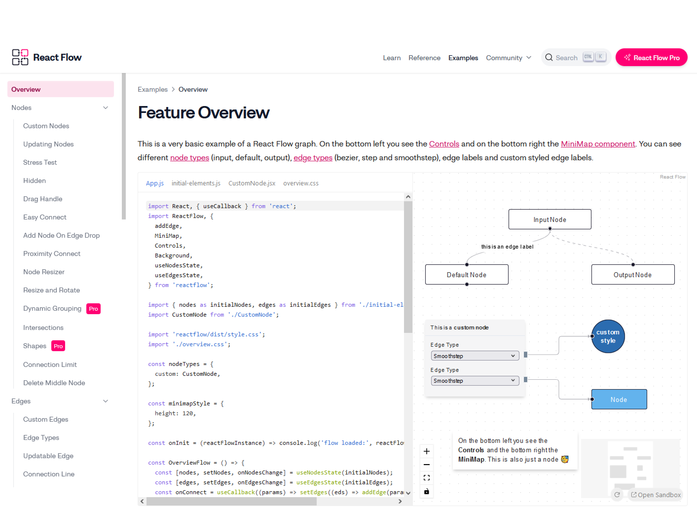
After comparing several libraries, I found React Flow most aligned with our needs - it supported node-based visualization, interactivity, and modularity, all critical for long-term reuse.
Solutions
Early designs:
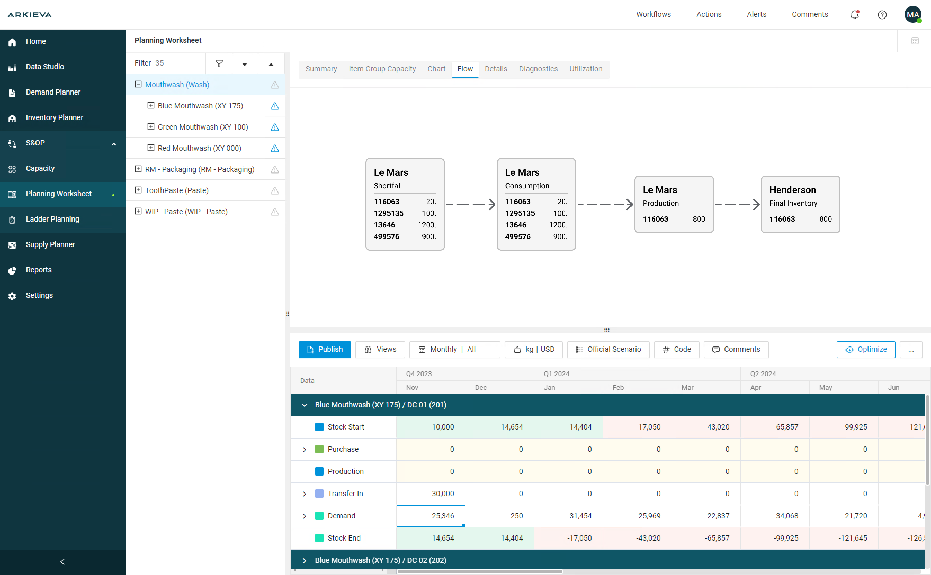
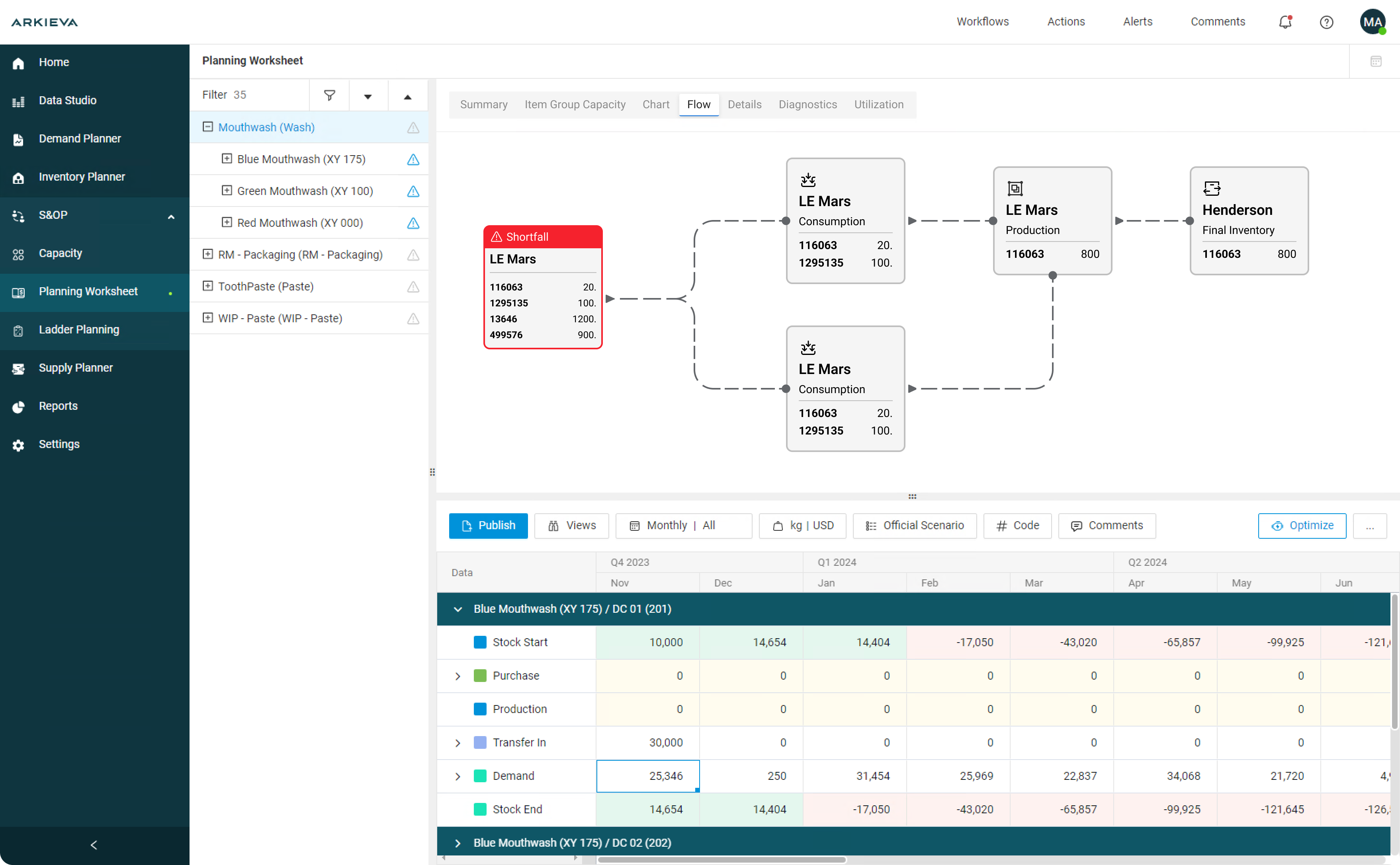
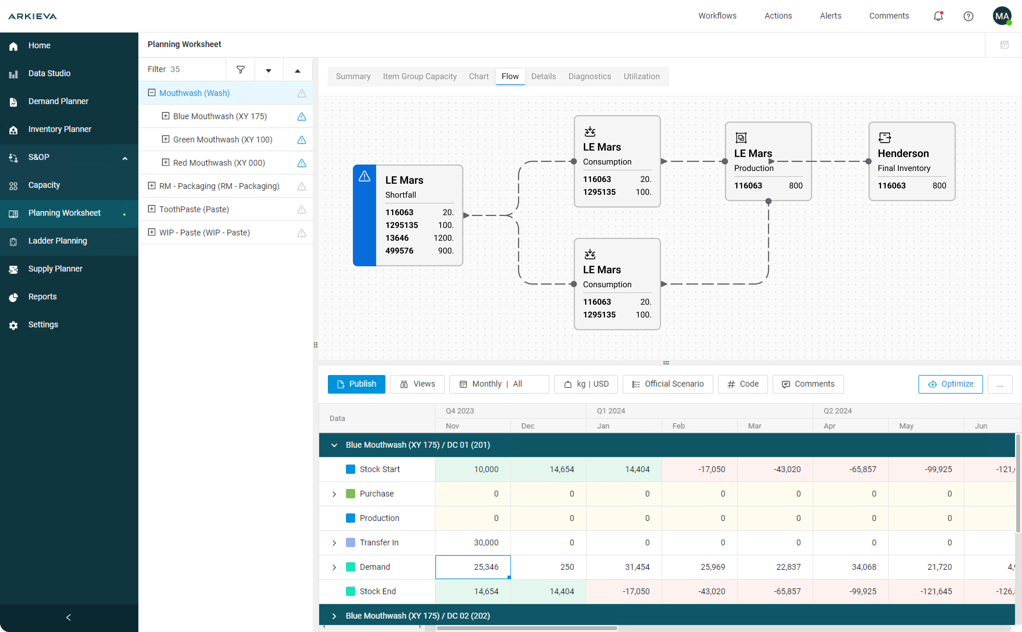
The initial proposition to the developers and business was as follows:
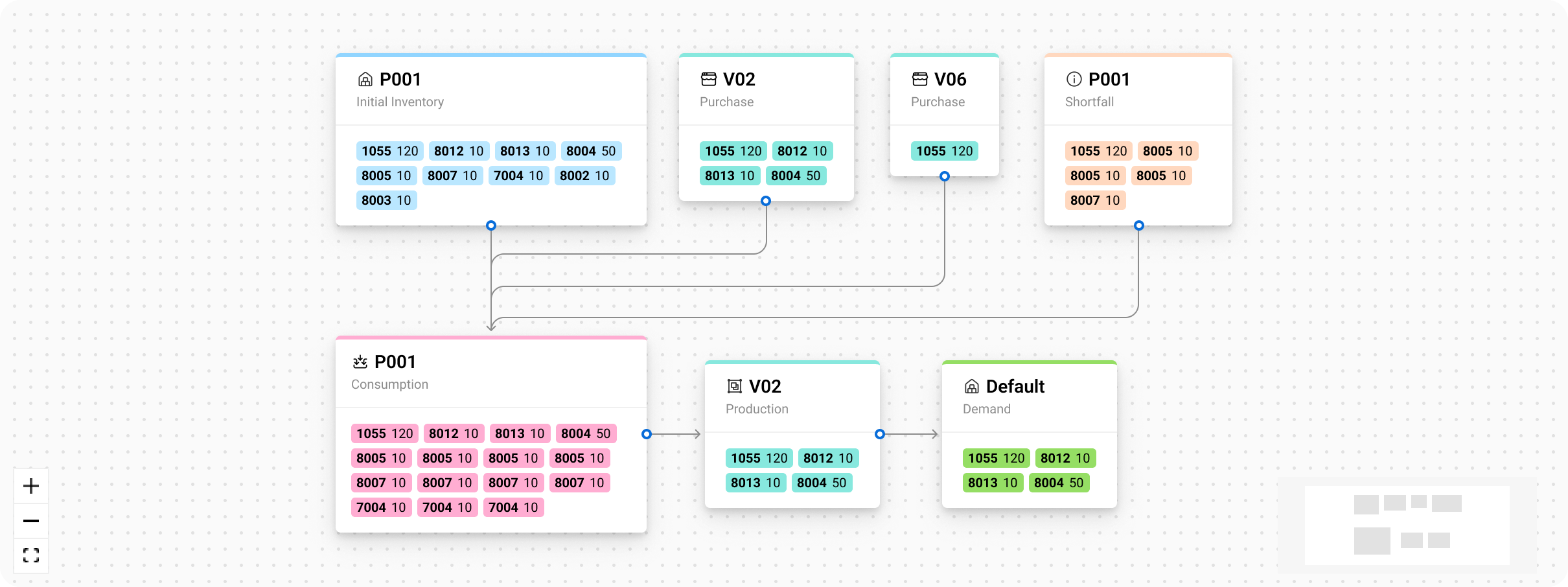
OR
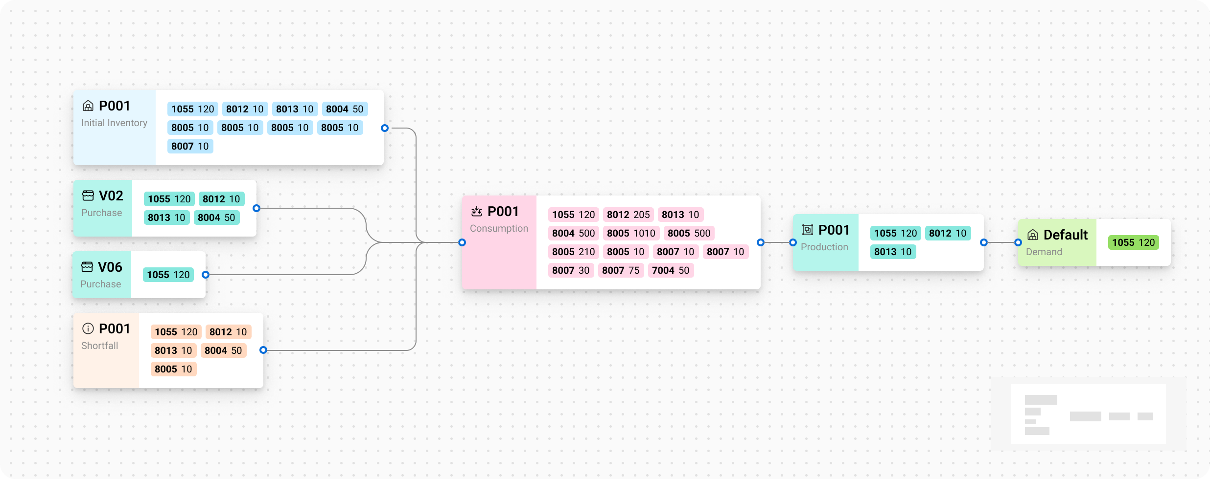
Ultimately the horizontal layout was chosen due to it being easier to follow.
While it might seem confusing at first, every node represents a state in the Planning Worksheet and the items in that state or location. The items are represented as codes - as this is how clients navigate their library of items, products and locations.
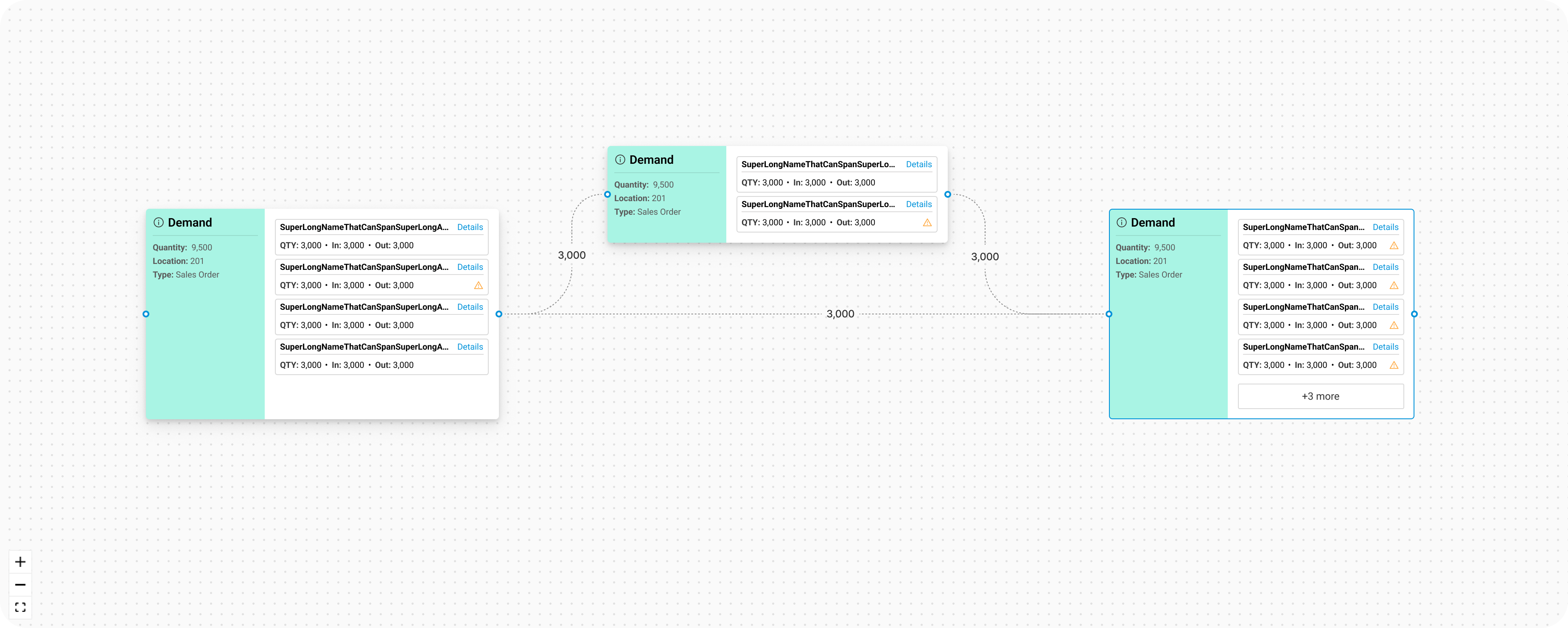
There were a lot of iterations on this deciding on how it should look and what type of information is available from the back-end and what needs to be added. Quantities going from one node to another were added to the line itself to make it more clear what quantity is going where.
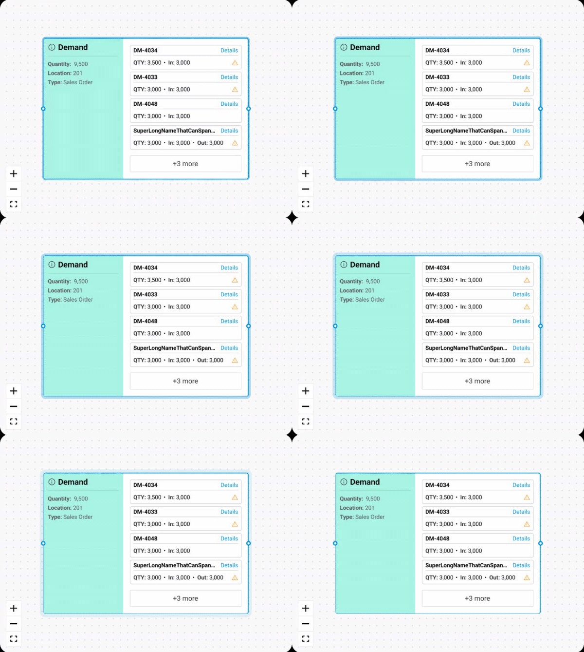
Micro interactions and more styling was added to the nodes making them even more appealing and giving out more feedback about what's going on.
Impact and Reusability
When this feature went live, it didn’t just fix one visualization problem - it changed how we thought about data representation across the entire product.
Before, each chart or graph in the system was built independently. Every new visualization required its own custom logic, which made the platform inconsistent and hard to maintain.
By introducing a node-based visualization system, we unintentionally created a design and technical framework that could be reused across the product - saving time for both design and engineering.
Here are a few other examples of how I started using this library to leverage the future designs of features.
The feature request:
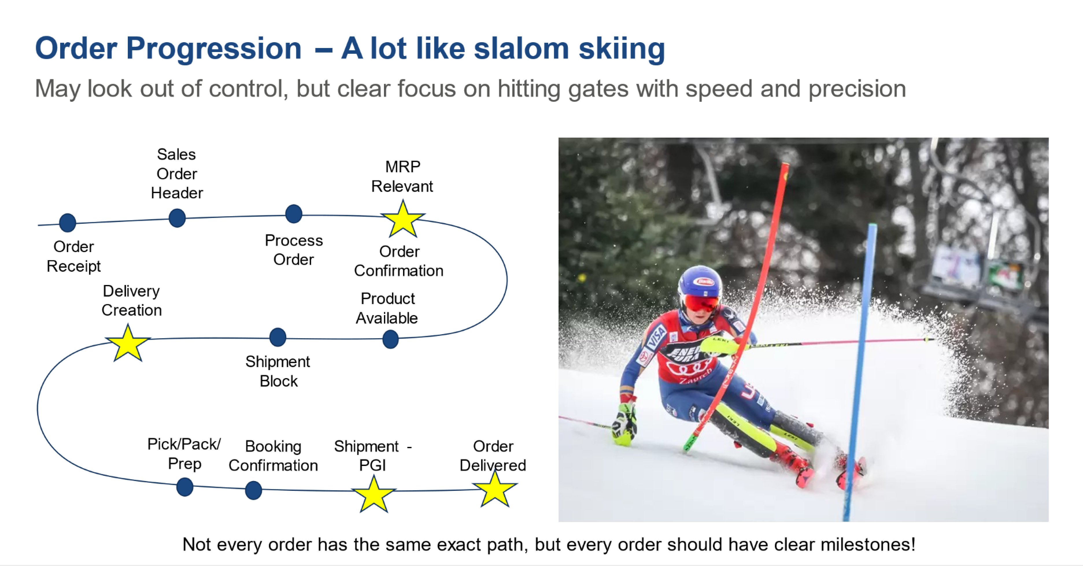
Part of a slideshow that was presented to us by one of our clients
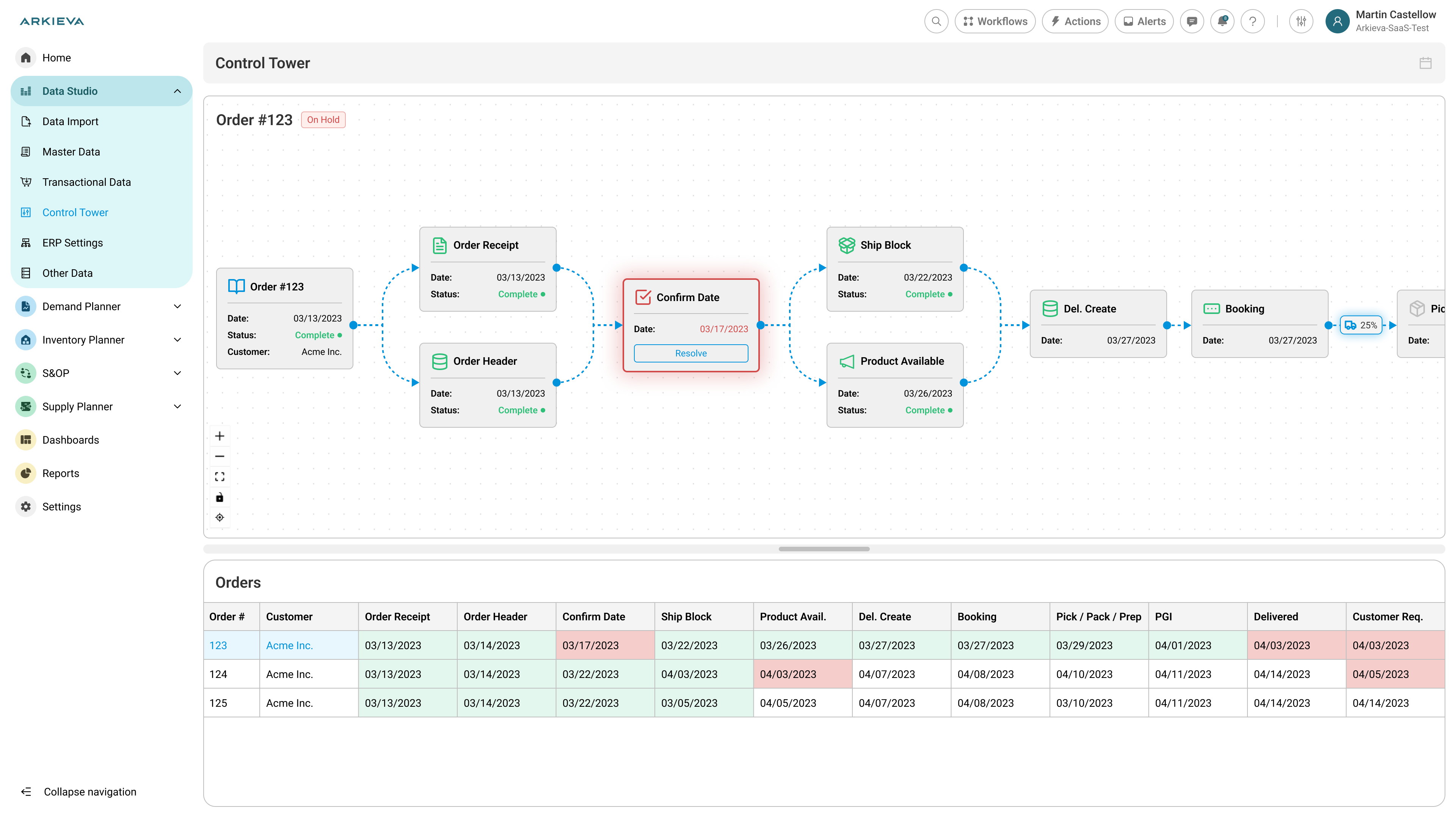
The proposed (and later implemented) solution:
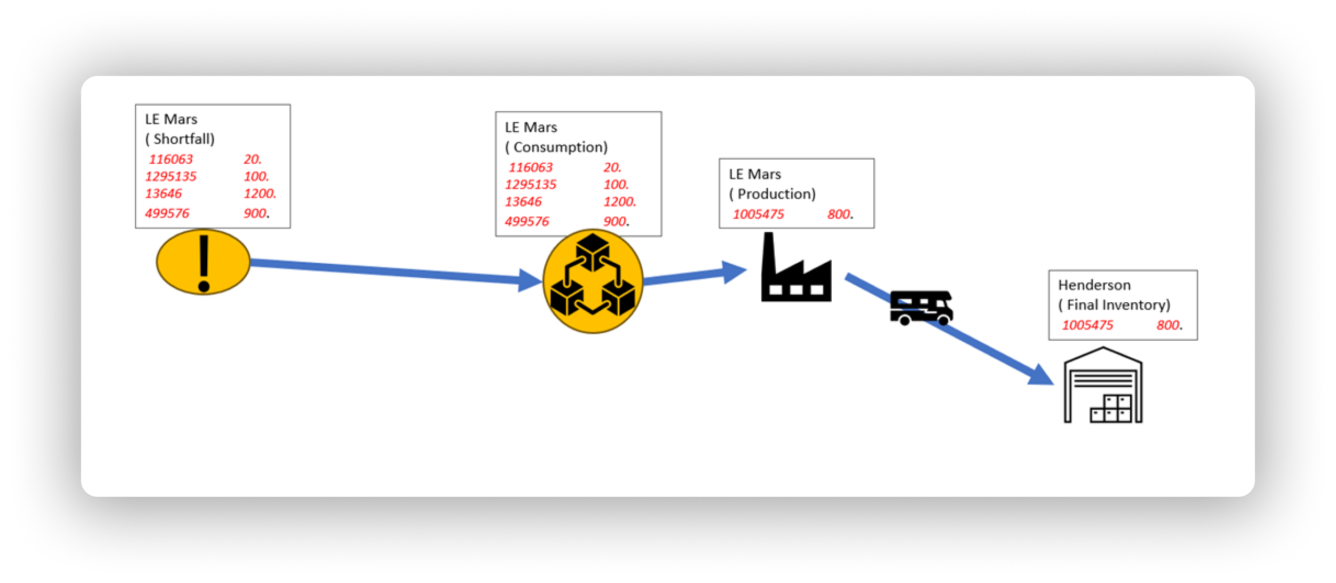
What the business wanted:
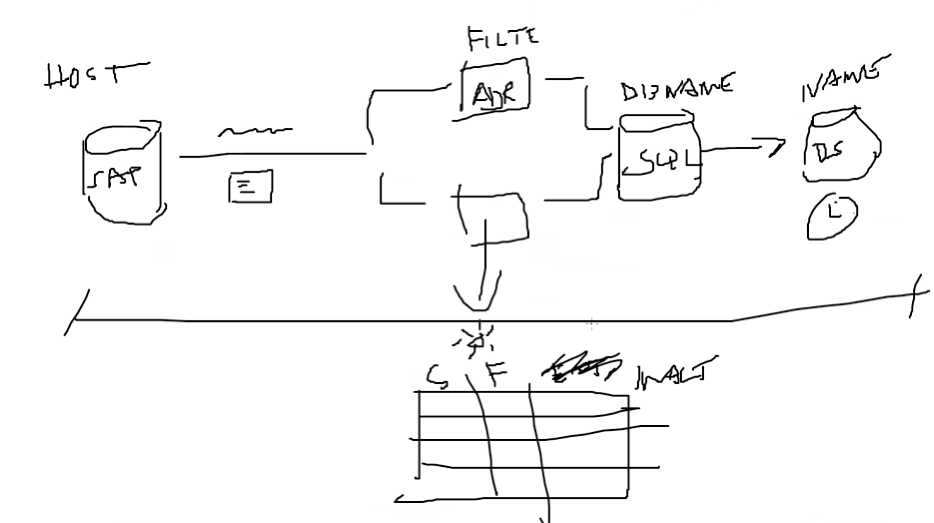
A 'napkin drawing' of how the feature was visualized given to me to go off by
What the design looked like after using node-based visualization:
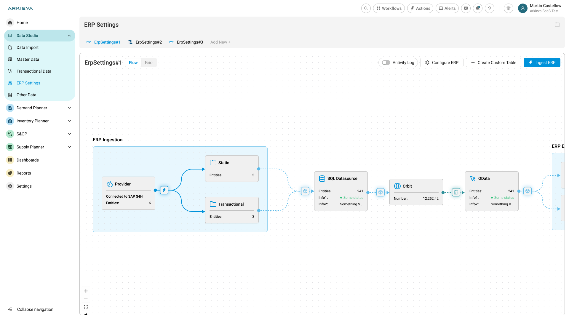
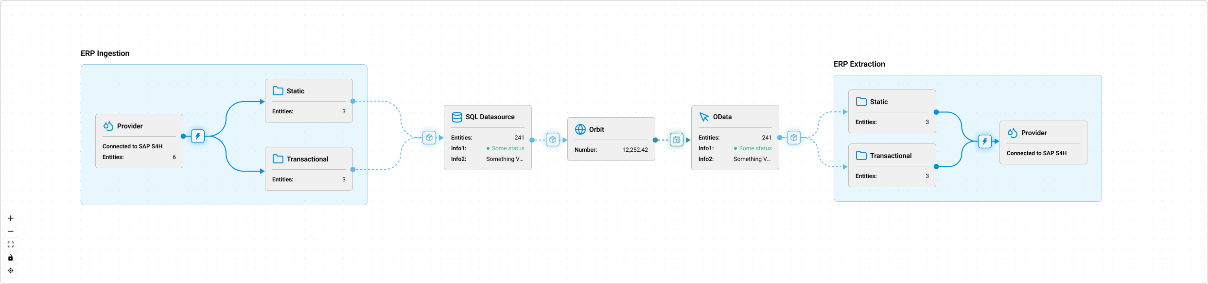
Micro interactions and different layouts were created to fit the need of all the features and wants of the business and product and also make it more attractive to the common user using this user interface.
Design Principles and Learnings
While the end result looks simple, it came from a lot of iteration and back-and-forth between design and development.
A few key principles emerged from this project:
- Complex data =/= complex UI
The data behind these graphs is huge and multidimensional, but the interface had to stay approachable. Every decision - from the node size to line labeling - aimed to reduce cognitive load. - Reusability starts with clarity
Building reusable components isn’t only a dev task. As a designer, thinking in patterns (layout, interaction, visual hierarchy) helps others reuse your work naturally. - Interactivity is context, not decoration
Micro-interactions weren’t there just to look nice. They gave users confidence - highlighting connections, showing tooltips, animating flows - which made complex data feel alive and understandable. - Design and engineering alignment
Working closely with developers made a big difference. Instead of handing off static screens, I was designing inside the same logic that they were coding in. This cut down implementation time and miscommunication dramatically.
Results
- Improved data visibility: Users could finally trace how quantities move across the supply chain in a single glance.
- Reduced dev time: Future visual features were built 3–4× faster using the same library.
- Cross-team adoption: The same flow component is now used in at least 4 other parts of the product.
- User satisfaction: Qualitative feedback from internal demos and client calls showed excitement - they could “finally see how everything connects.”
Reflection
This project reminded me that sometimes solving a local UX issue can unlock something much bigger.
What started as a chart redesign ended up setting a visual foundation for multiple future features.
If I had to summarize it in one sentence:
Designing for clarity led to scalability.