ARX
/arks/
Arx is a Latin word meaning "citadel". In the ancient city of Rome, the arx was located on the northern spur of the Capitoline Hill, and is sometimes specified as the Arx Capitolina.
That said, when designing the logo I wanted to incorporate either the whole word (since it is 3 letters) or at least have the "A" letter somewhere. I began with a 3D tower with an isometric perspective applied to it, with the letters “A” and “R” as the bottom side walls and the letter “X” as the top. After a few iterations I still wasn't pleased with the results and scrapped the idea completely. Instead, I then chose to use a 2D perspective on the logo and have the “A” itself become the tower. For the typography I used the font “Montserrat” and modified it by rounding it’s edges.
Logo

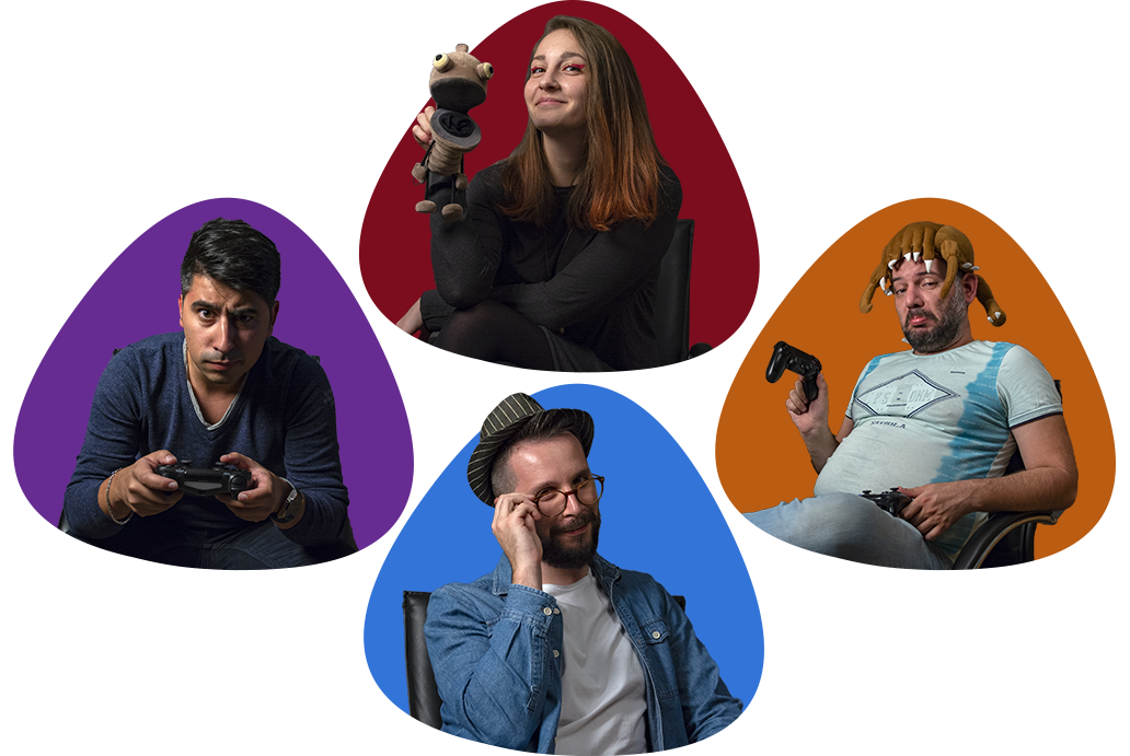
The shape of the logo itself needed to be unique enough so that is cannot be mistaken for another brand; it needed to be memorable and not just some random form. The rounded triangle shape I chose is inspired by the human body, or the user icon even: the top half of the body (shoulders + head) is triangle shaped and would be great as a stream camera mask. It is unique and can be explored quite a bit for marketing purposes.
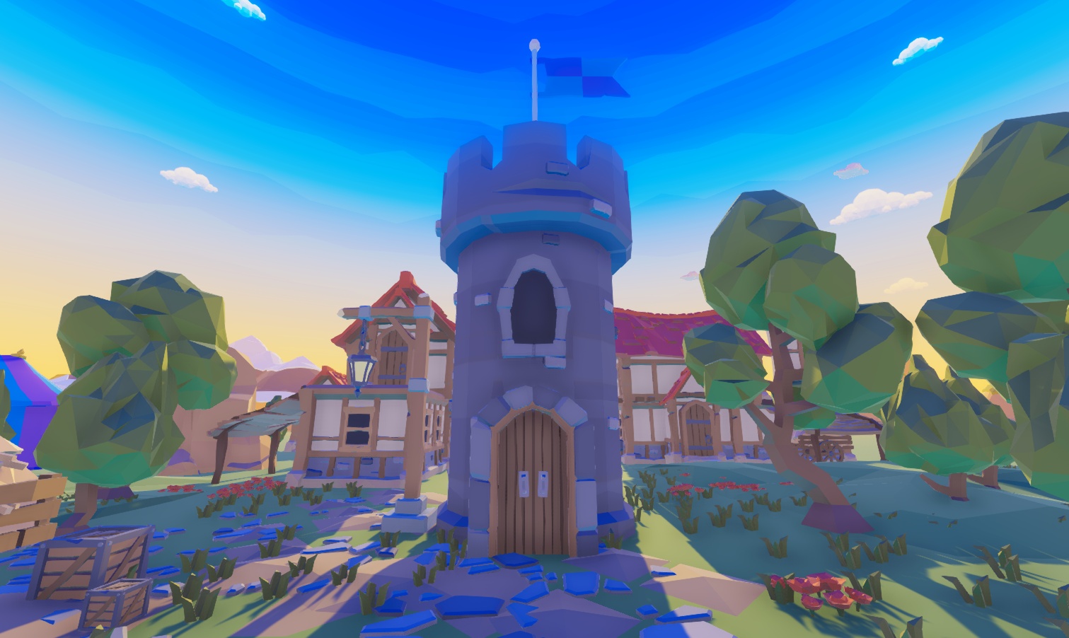
Later, after creating the logo and brand itself, I went back to 3D: a small virtual town would help expand the branding to new horizons! Using an asset pack, I created the beautiful town seen below in Unity and rendered it out so it can be used as a Facebook banner in order to commemorate the project's first birthday.
Typography
For typography, I felt I wanted to use a condensed font that supports cyrillic script: it would be seen across the entirety of the brand, in ad campaigns, Facebook posts and everything else ARX-related.
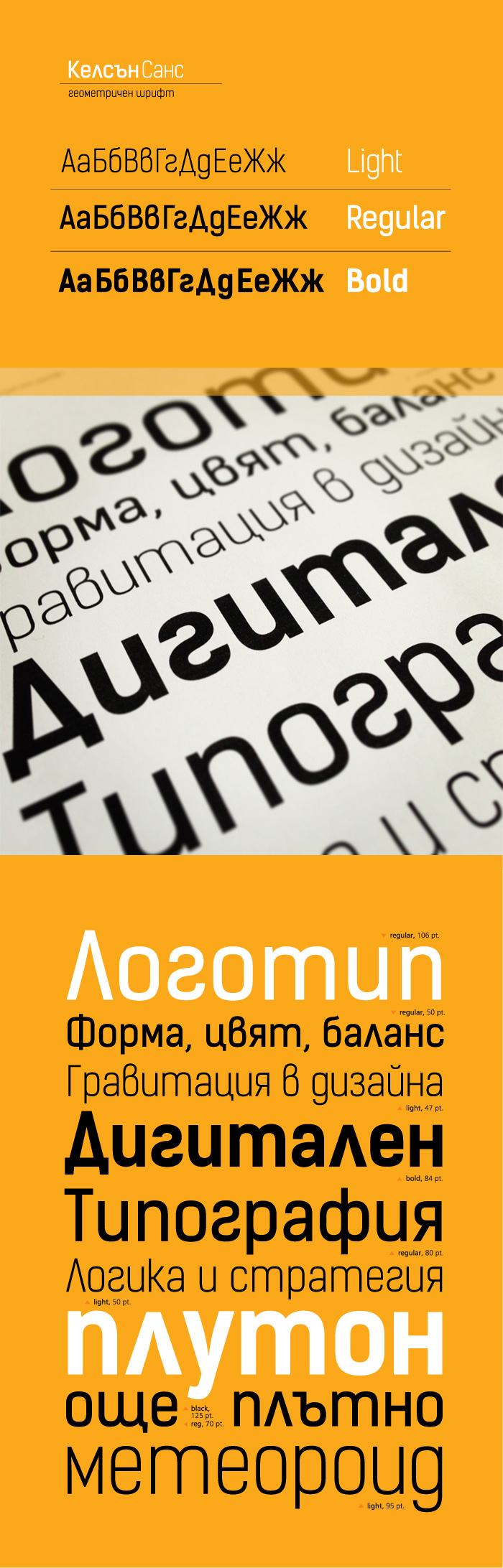
Check out the full case study of Kelson Sans over at FontFabric
Colors
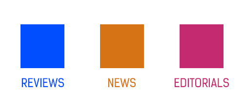
Different website categories, such as reviews, news and editorals, needed to be more defined, and so did the brand itself. Since ARX's main focus is ultimately on reviews, I chose the colour blue due to its calming effect. Orange is a much more stimulating colour, so I picked that for the news category.
Lastly, I went with purple for the editorials, as the colour is widely regarded as a symbol of royalty and wealth: in ancient times, creating dyes to colour fabric often required a great deal of effort and expense, especially for certain hues. Purple dyes, being rarely found in nature, were especially troublesome to produce, thus earning the colour itself a prestigious status. By making the editorial category purple, I give the readers a sense of quality, especially since editorials don't get published that often and take much more time to write and publish.
Website
The website initially relied on reviews only, and would gradually open up to news and editorials.
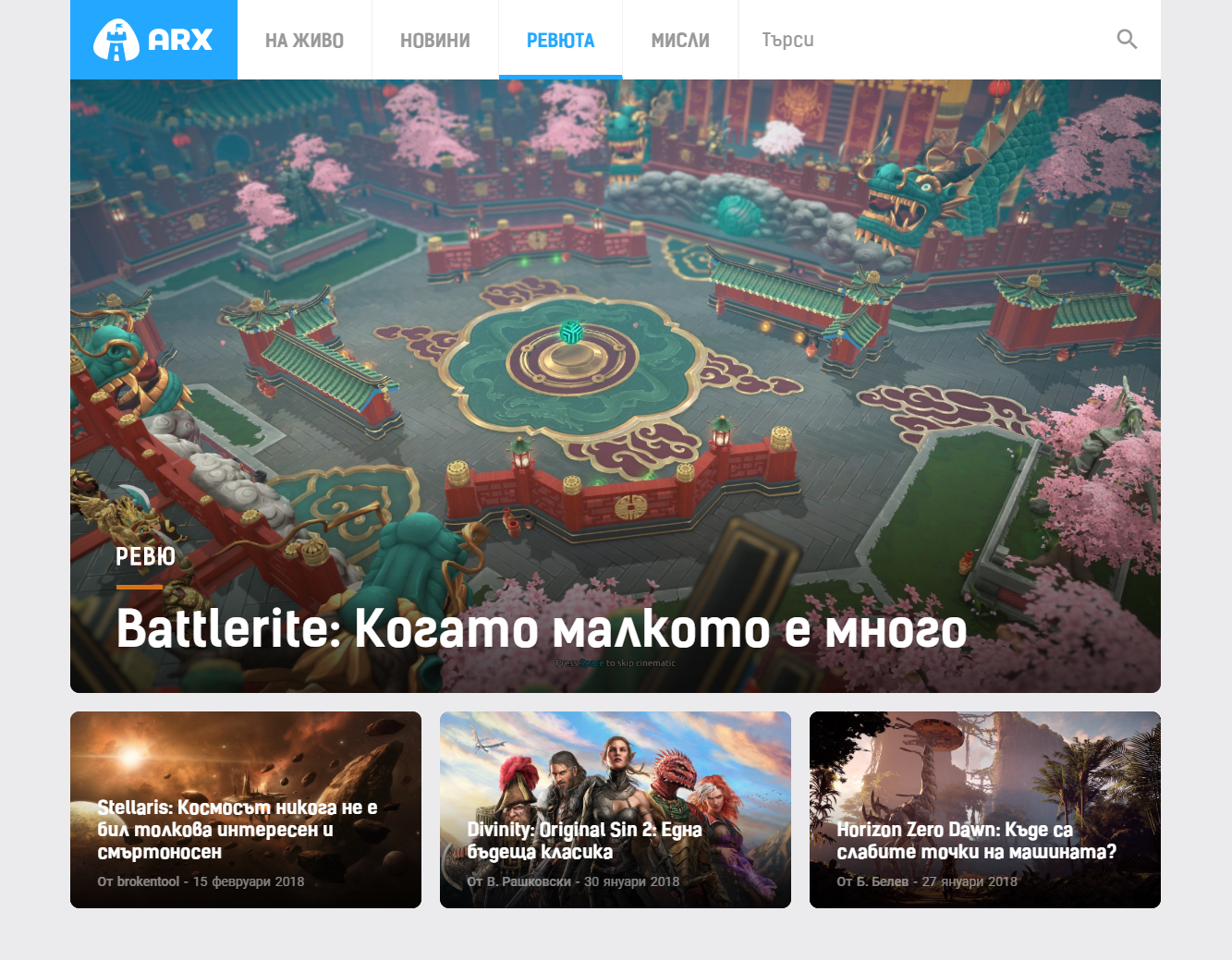
ARX Homepage v1
Whenever I've read about games, I've always found the screenshots, art and covers to be awesome, so I really wanted to highlight them in ARX's design. Everything is given a nice big card so that the game can be properly showcased.
After a bit of time, I noticed that the header might be a bit too big for some monitors - especially laptops. According to the maps which Hotjar generated, about 70% users scrolled further down into the site, while the other 30% left once greeted by the large banner.
I later reworked the entire website, giving the three categories a prime location at the start of the page. The overall changes made to the layout and UI improved the scroll and click-through rate by a large amount!
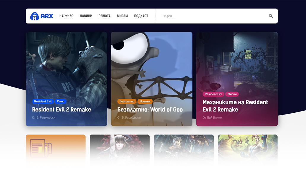
ARX Homepage v2
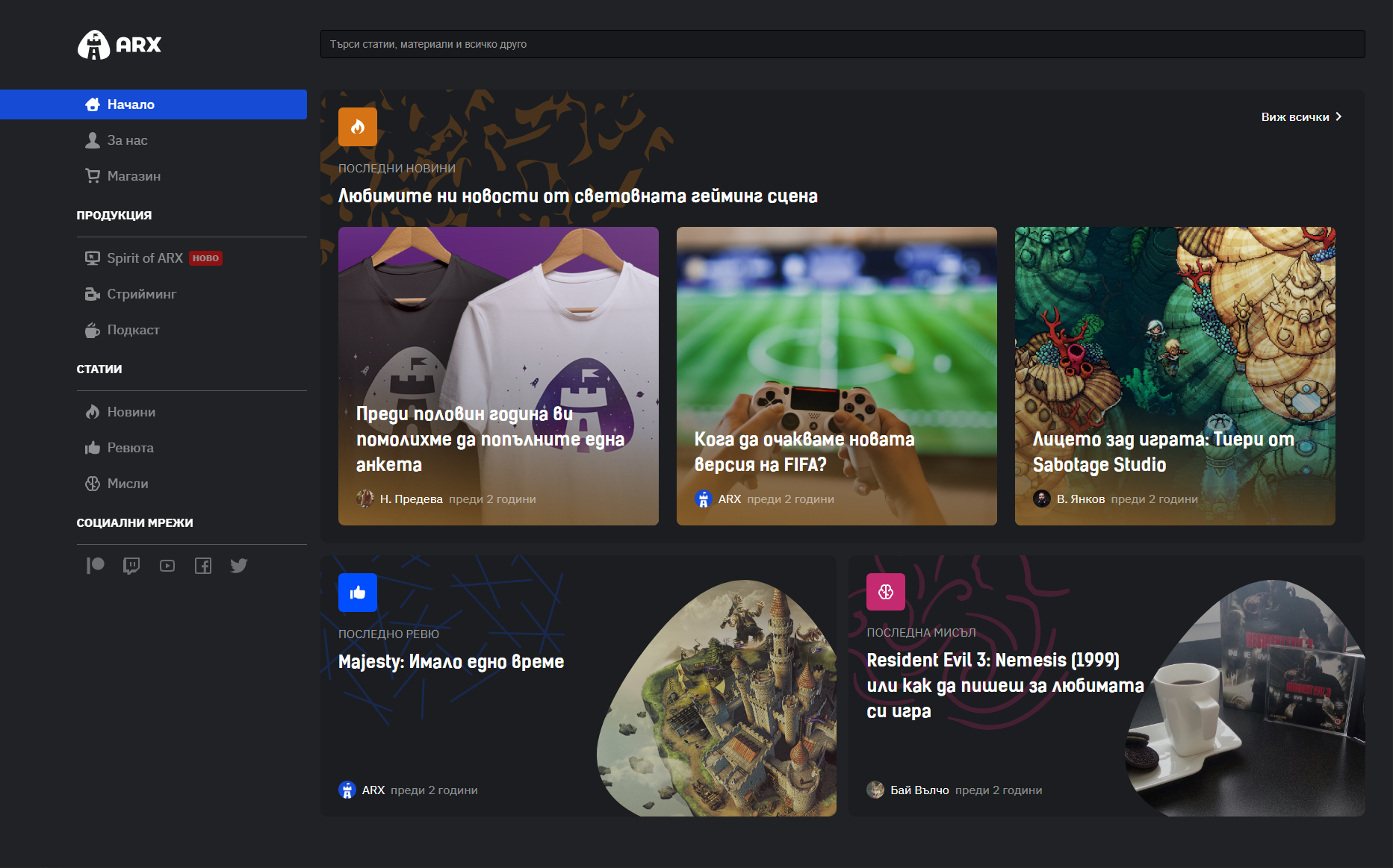
ARX Homepage v3 (current)